Advertisements
This entry was posted
on Sunday, March 14th, 2010 at 1:57 am and is filed under Technology.
You can follow any responses to this entry through the RSS 2.0 feed.
You can leave a response, or trackback from your own site.
1 response so far!
-
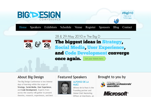
this really is a kick-asp website – I love the mix of typefaces because the push the hierarchy and architect the information that doesn’t need the greatest amount of love. It’s poster design for interactive without losing the core competency of communication -AND- user experience.


